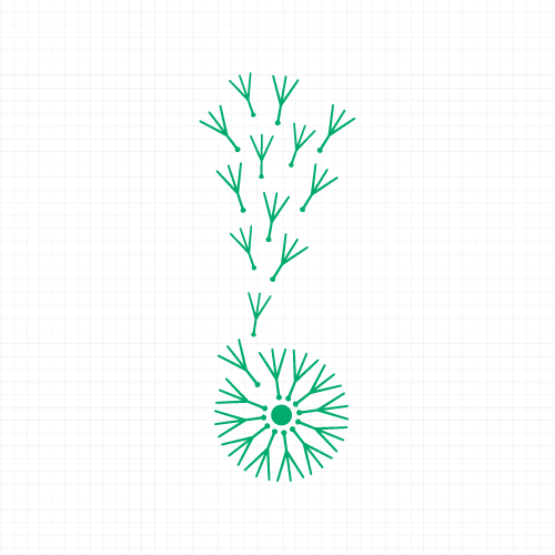
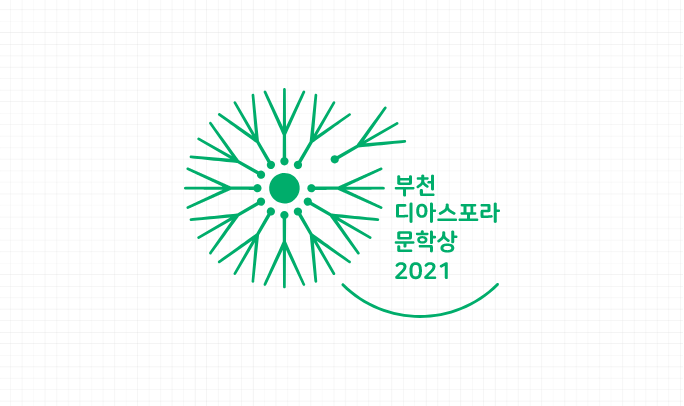
The
design of the BUDILA logo reflects the purpose of the award’s
establishment. The motif depicts dandelion seeds being blown
around the world by the wind before blooming and taking root in an
unfamiliar land. The fluttering flower seeds represent the
expansiveness, creativity and strong life force of diaspora, while
the cluster of seeds symbolizes solidarity and hospitality. An
image (symbol mark) was chosen for BUDILA’s design rather than a
name (text mark) so that the meaning of diaspora can be easily
conveyed to people in a familiar manner.
Symbol & Wordmark
Korean
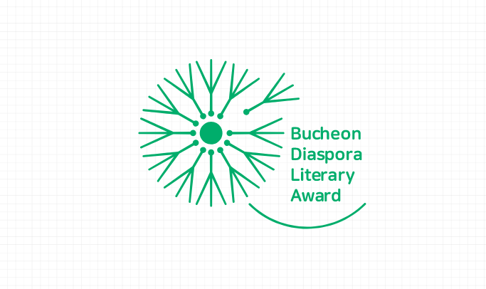
Symbol & Wordmark
English
Main Color is Diasora
Green.
Sub Color can be
Diaspora LILAC.
Diaspora GREEN | RGB(0,173,107) , CMYK(76,0,73,0)
Diaspora LILAC | RGB(232,202,214) , CMYK(9,26,7,0)
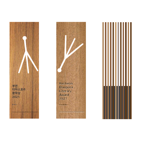
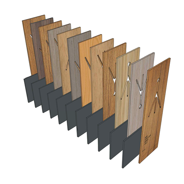
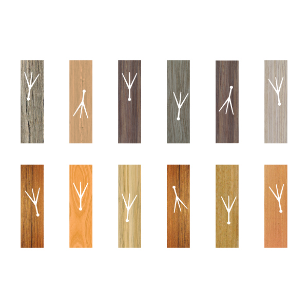
The main material used in the plaque is wood, a symbol of diaspora that represents people dispersing like seeds,
settling in the soil of another society and putting down roots to grow and develop.
The twelve dandelion seeds represent native trees from locations around the world,
and making them into a single plaque imparts the meaning of migration, taking root,
and convergence and integration between cultures.
The dandelion seeds that run through the twelve wooden boards embody the determination to overcome social conventions
and put down strong roots. To express the dynamism in the relentless challenge and ever-changing nature of diaspora,
we plan to produce the top part of the rectangular boards in a different shape every year by abstracting the diaspora
contained in the winning novel, while also changing the direction of the dandelion seeds each year to express
the concept of being carried and spread by the wind.